
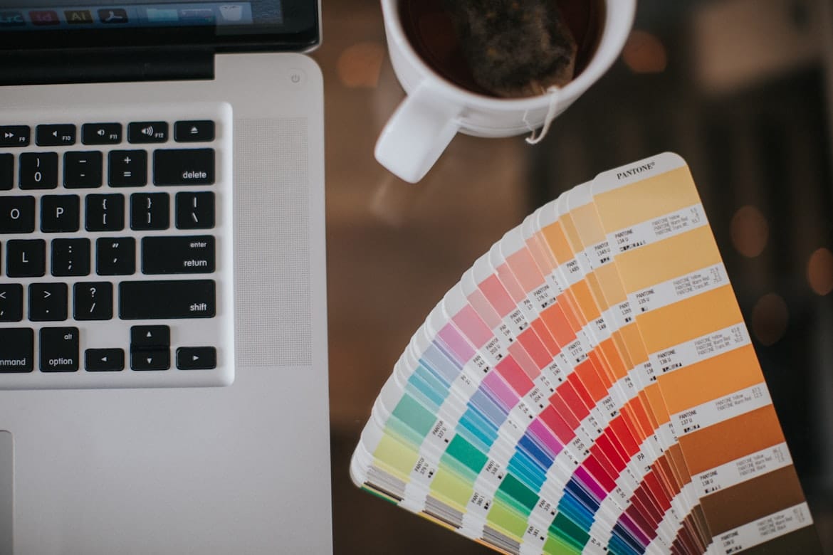
Why Color Matters in Design
Color is often the first thing people notice about a design. Before reading a headline or exploring a website, users subconsciously react to the colors they see. These reactions can influence emotions, shape perceptions, and even affect purchasing decisions.
For designers, color is much more than decoration—it's a powerful communication tool. The right color palette can strengthen a brand's identity, improve usability, and guide users through digital experiences. Understanding how colors influence human behavior allows designers to create visuals that are both beautiful and meaningful.
What Is Color Psychology?
Color psychology is the study of how different colors influence human thoughts, emotions, and behaviors.
Although cultural differences and personal experiences can affect interpretation, certain color associations are widely recognized.
Designers use color psychology to:
- Build emotional connections
- Improve brand recognition
- Highlight important information
- Enhance user experiences
- Influence purchasing decisions
- Create visual harmony
Choosing colors intentionally helps communicate the right message.
Understanding Common Color Meanings
Every color creates a different emotional impression.
Blue
Often associated with:
- Trust
- Stability
- Intelligence
- Calmness
- Professionalism
Blue is commonly used by technology companies, financial institutions, and healthcare brands.
Green
Represents:
- Nature
- Growth
- Health
- Sustainability
- Freshness
Green is frequently chosen by environmental organizations and wellness brands.
Red
Communicates:
- Energy
- Passion
- Excitement
- Urgency
- Confidence
Red naturally attracts attention and is often used for promotions or call-to-action buttons.
Yellow
Often symbolizes:
- Optimism
- Creativity
- Happiness
- Warmth
- Positivity
When used carefully, yellow creates energetic and welcoming designs.
Choosing the Right Color Palette
A successful color palette balances aesthetics with functionality.
When selecting colors, consider:
- Brand personality
- Target audience
- Industry expectations
- Accessibility
- Emotional impact
- Visual consistency
The goal isn't simply to choose attractive colors, but to create a cohesive visual language.
Color Improves User Experience
Colors play an important role in helping users navigate digital products.
Good UI design uses color to:
- Highlight important actions
- Differentiate content sections
- Communicate status messages
- Improve readability
- Create visual hierarchy
- Guide user attention
Thoughtful color usage reduces confusion and makes interfaces easier to use.
The Importance of Contrast
Even the most beautiful color palette can fail if contrast is ignored.
High contrast improves:
- Text readability
- Accessibility
- Visual clarity
- Button visibility
- Navigation
- Overall usability
Designers should always ensure that text and interface elements remain easy to distinguish across different devices and lighting conditions.
Color Consistency Builds Strong Brands
Successful brands use consistent colors across every customer touchpoint.
Consistency should extend to:
- Logos
- Websites
- Mobile applications
- Social media
- Marketing materials
- Packaging
A recognizable color palette strengthens brand identity and helps customers instantly recognize a business.
Common Mistakes Designers Make
Color can improve a design—or weaken it if used carelessly.
Avoid these common mistakes:
- Using too many colors
- Ignoring accessibility guidelines
- Low contrast text
- Inconsistent branding
- Following trends without purpose
- Overusing bright accent colors
Keeping color choices intentional leads to stronger and more effective designs.
Future Trends in Color Design
As digital experiences continue to evolve, designers are exploring more adaptive and inclusive color systems.
Emerging trends include:
- Dynamic color themes
- Dark mode optimization
- Personalized interface colors
- Nature-inspired palettes
- Sustainable brand aesthetics
- AI-assisted color generation
These innovations allow products to become more personalized while maintaining visual consistency.
Final Thoughts
Color is one of the most influential elements in design. It shapes first impressions, communicates emotions, and guides user behavior in subtle yet powerful ways. By understanding color psychology and applying it thoughtfully, designers can create brands and digital experiences that are visually compelling, emotionally engaging, and easy to use. Great design isn't just about choosing beautiful colors—it's about choosing the right colors for the right purpose.